
MindfulMe Case Study
Timeline
March 2023 - June 2023 (12 weeks)
My Role
Design and Researcher (solo project)
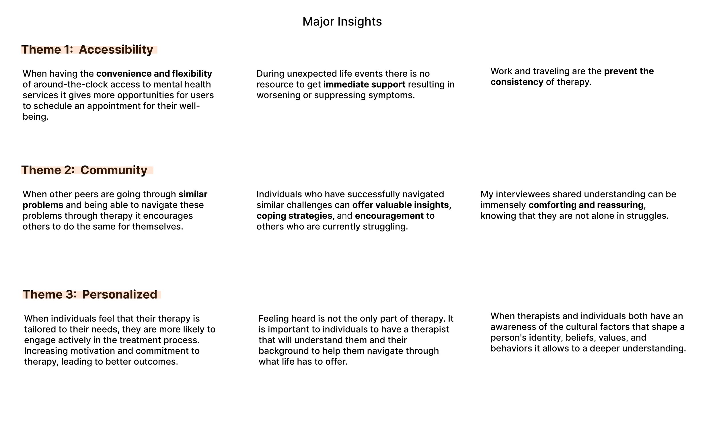
Problem
Failure to access therapy
Paying an arm and a leg for healthcare, yet was I still unable to find a therapist during a time when I was having a mental health emergency. This sparked the question - how many of us can actually find a therapist in a timely manner during times of need?
The Approach
Mental health is too important to be left to medical professionals alone
In a world where accessing mental health services during critical moments remains a significant challenge, this case study delves into the underlying issues contributing to the failure of individuals to access therapy promptly. Despite investing significantly in healthcare, the inability to secure timely therapeutic support during mental health emergencies has become a prevalent concern. This study aims to apply behavioral science principles to analyze and understand the barriers hindering individuals from finding timely therapy and proposes strategies to alleviate this pressing issue.
WHITE PAPER RESEARCH
Unveiling Accessibility Barriers Through Statistic Insights…
Starting with white paper research, I began to draw from research articles on the topic of barriers, accessibility, and - when I stumbled upon an eye opening statistic from Mental Health America:
“..over half (56%) of adults with mental illness receive no treatment. Over 27 million individuals experiencing a mental illness are going untreated due to accessibility barriers”
COMPETITIVE ANALYSIS + THE GAP
The competition had NO FEATURE to seek professional help.
While keeping the above statistic in mind, I analyzed the 3 most popular apps surrounding the mental health care space. I found that none of these apps offered access to a licensed therapist for immediate assistance. This then became my opportunity for the solution.

USER INTERVIEWS
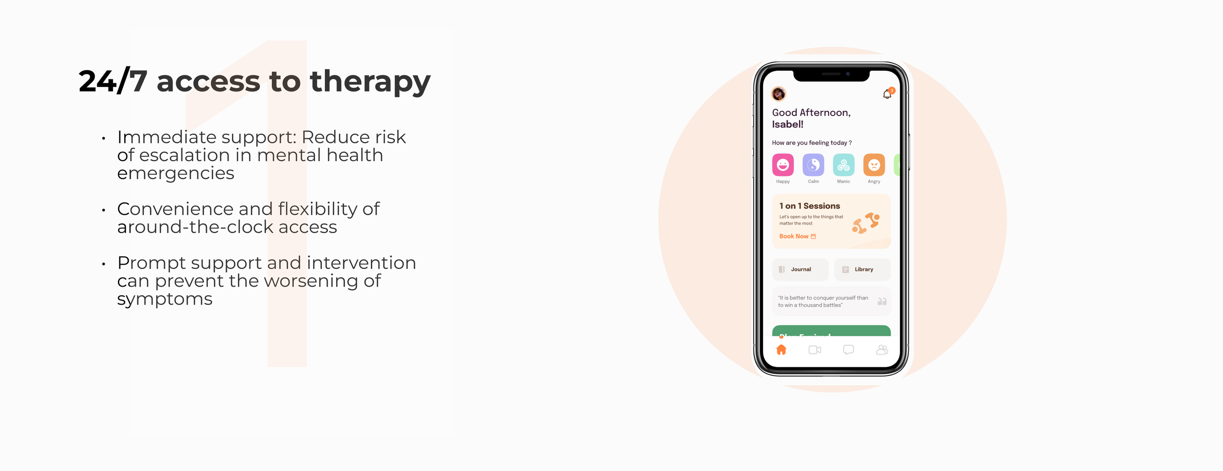
My interviewees were 3x more likely to make a therapy appointment when there was 24/7 access and last minute availability.
Through my research I gained deeper insights into how therapy is necessary and important to my users. However, my 8 user interviewers struggled with scheduling therapy appointments. To understand the trends on why they struggled with this task I used a mixed-methods approach. My research began with a survey that asked the questions below.
RESEARCH QUESTIONS:
What specific mental health challenges or concerns do you currently face?
How often do you experience these challenges, and what are the triggers or patterns associated with them?
What type of support or resources do you currently seek or utilize to manage your mental health?
Are there any particular features or functionalities you would like to see in a mental health app?Tell me about a time you had to do something difficult and accomplished it.
Would you be interested in connecting and sharing experiences with a supportive community of individuals facing similar mental health challenges?
THE MAIN INSIGHT
None of the previous apps my interviewees used worked due to LACK of professional help.
Through an analysis of patterns within my affinity map, a notable trend emerged: individuals lacking access to professional mental health support through applications tend to undervalue the importance of seeking expert help. This lack of accessibility significantly diminishes their motivation to pursue professional assistance.
PERSONA

The Solution


TESTING + IMPROVEMENTS
3 major improvements in my design
Based on various feedback from 8 other peers + mentor feedback, I continually iterated my design over the span of 4 weeks- with 3 major improvements:


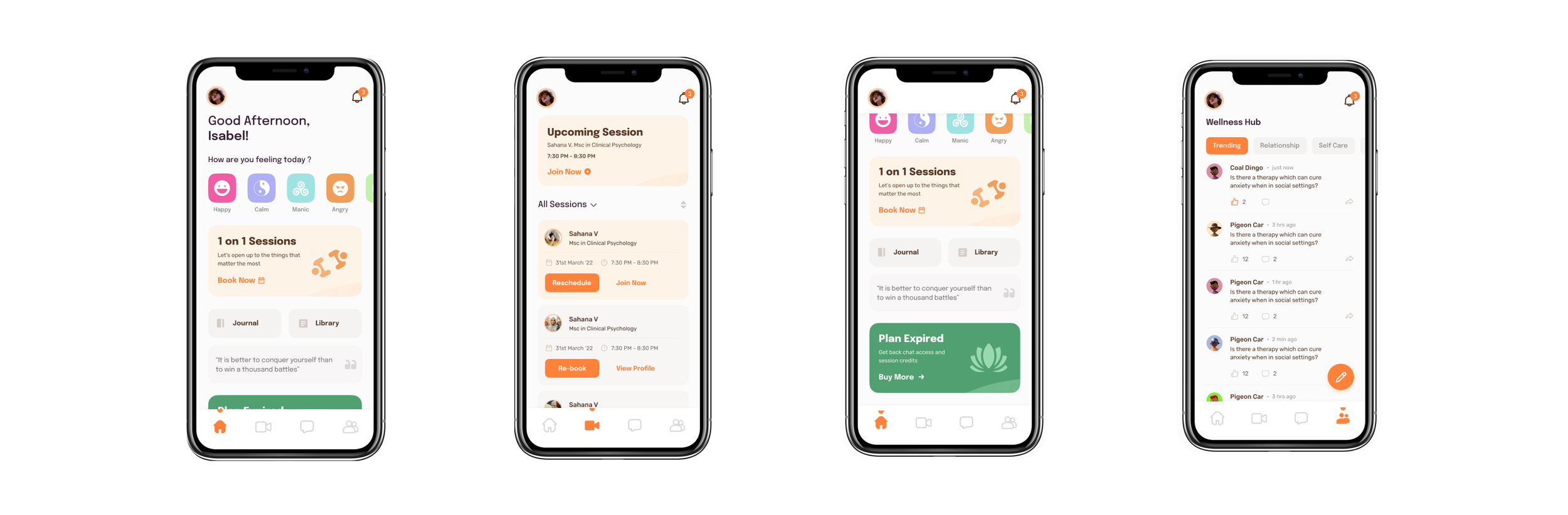
THE FINAL SCREENS
The final product
CONCLUSION + LESSONS LEARNED
What I’d do differently next time.
This was my first-ever UX project (Hooray)! 🎉. More than the actual output, however- I’m immensely grateful to have been through an entire UX process so I can see what it’s actually like. On that note, a few things I’ve learned:
Iterate as much as you can. In the beginning stages, I’ve explored so many different options to try finding the right solution for my student users- I’ve ended up “restarting” my project over 3 times with over 9 iterations of my FIGMA file to make sure every aspect of the app was designed with intention. Not to mention- I have a better sense to obey WCAG standards next time!
Focus more on tradeoffs with each direction. Although at first, I explored solutions using VR/AR, I hope to become stronger in communicating these tradeoffs with the user in mind so I can better communicate my design decisions to myself, my mentor, and future recruiters.
Be insight- not process-driven. Despite weeks of research + development, my first version of this case study was full of unnecessary text at this stage instead of tying everything into the bigger question- “so how does this fit into the bigger picture”? Hence, I cut down the copy by more than 60% and focused on the major points in my project. Hence, going forward I believe focusing more on the insights will improve my storytelling abilities to others.
You didn’t fail- you just found 100 ways that didn’t work. From noticing mistakes in my UI to uncovering more foundational UX problems in my app, I’m thankful to have constantly asked for feedback from my peers and my mentor. In the end, I pushed to have the app as best I could, and did not let my own thinking stop me from questioning if my own decisions were truly best for the user.
DESIGN
Setbacks + a new direction for therapy
At first, I spent 2 weeks trying to play with three different directions: Augmented Reality, Virtual Reality, and an app solution. However, upon thinking about its effects I realized that on a daily basis, using either augmented or virtual reality may be more of a hassle than a benefit. The same effects can be achieved though a simple smart phone app, hence- I stuck to an app for my final solution platform.